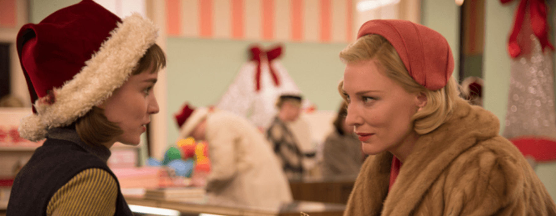
I came across this article the other day and found it quite interesting. I don’t know much about the movie, but this writeup definitely piqued my interest. Colored by John Dowdell on Quantel Pablo Rio the look of the film is incredible. This quote really grabbed me and I think it’s a perfect explanation of the feel that they were trying to achieve…
“The film’s palette emphasizes, especially in the interiors, the sour greens, yellows and dirty pinks of the era—slightly soiled colors that give viewers the feeling of the post-war city before the brightness of the Eisenhower administration had taken over.”
I instantly knew this was shot on film, it’s pretty obvious. That’s real-deal 16mm grain that you see. It’s pretty cool to see some 16mm stuff hitting the big screen. There really is nothing else that can replicate it. Just goes to show that when placed in the hands of the best of the best film can be pretty amazing.
Will definitely put this on the to-watch list. Reminds me a lot of Woody Allen’s “Irrational Man” from last year. I think alot of that film’s look was controlled more with costume and set dec. Felt like a bit of an homage to two-strip processing.