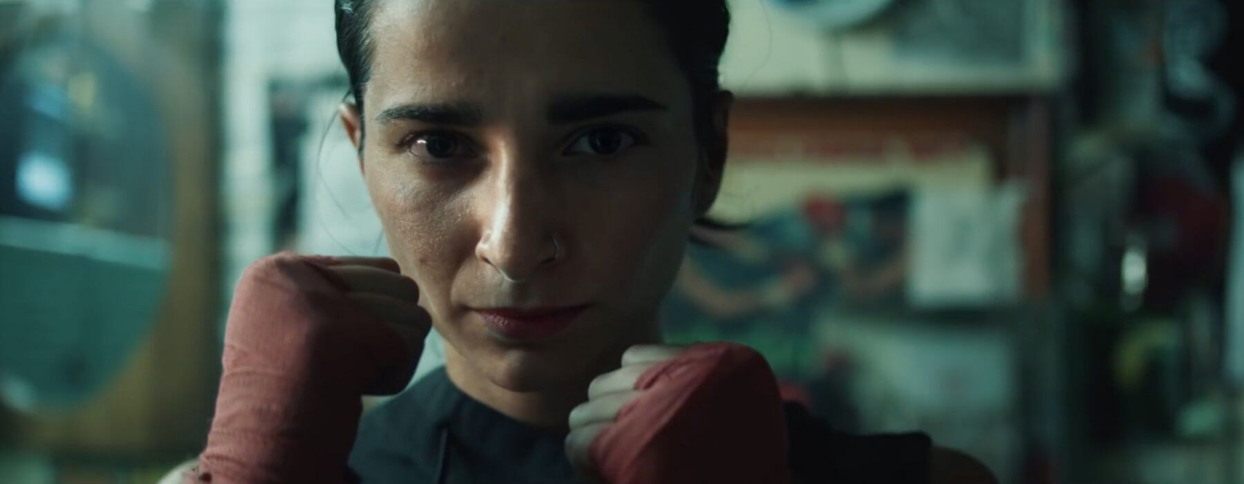
For me, one of the most exciting trends that has developed over the last year or so is dark cinematography. In the commercial world in which I work, almost all the grades I do have to be bright and well exposed. It’s probably just my clientele, but I feel like the most common request I get in the color suite is “can we make the face/product brighter?” I feel like it’s a pattern of habit and a bit of a safety net for advertising agencies as they are looking out for their clients’ best interests. It’s no fault of theirs – it’s a risky move to go dark – but I feel like the look pays serious dividends on the back end and in turn really makes the product stand out from the crowd.
As advertising shifts away from the standard :30 commercial I wouldn’t be surprised if we see the envelope pushed a little further. Longer format online content is playing a much larger role with some major players. And it seems to be working. The traditional approach to advertising is becoming a thing of the past. It’s definitely still relevant, but there needs to be supplemental content.
One of the most common terms that I hear when someone is describing an intended color direction for their work is that they want it to look “cinematic”. Well, take a look at any modern movie that you consider “cinematic”. Chances are it’s pretty damn dark. And guess what? That’s what light does! There are bright patches of light and there are dark patches of light. In reality, peoples’ faces aren’t always perfectly lit. Sometimes they fall into shadow. Why fight it? As colorists, one of the biggest things that we generally want to avoid are crushing the blacks and losing detail. Currently, it’s a big no-no (but obviously that’s not always the case – especially 10-15 years ago). But that doesn’t mean things can’t be dark. The lighting during production plays a huge role in determining the overall look of a piece, and it’s our job to run with it, not fight it.
I have been meaning to post something about this type of work for quite some time, but this article from Ad Week finally pushed me to do it. It’s no surprise that this style of work which I’m referring to tends to be a little more on the grungy side. It just fits. Athletic brands seem to be the biggest adapters as they lean towards a grittier style while showcasing their brand. There is more flexibility with that type of content than, say, food commercials.
Probably one of the best DP/Colorist combos that I have seen for this style is Max Goldman and Tom Poole. Max and Tom have been working together for quite some time and have achieved a great dynamic that really allows them to pull out the best from each shot. When teamed together these guys have created some of my favorite work in recent memory. It’s really impressive. For a more in-depth insight on Max’s (and Tom’s) work make sure to check out The Wandering DP podcast that breaks down a “dirty and abstract” Carhart commercial.
Trends come and go in the world of color correction. It’s necessary for looks to keep evolving so everything doesn’t look the same. Dark cinematography can seem like a bit of a risk to some brands, but what fun is it to play by the rules? Mix it up a little. Be creative. My aesthetic leans towards darker images, so this style of grading is right up my alley. Dark is not a bad thing – it’s natural. Of course in the end you have to give the client what they want, but it doesn’t hurt to showcase some darker looks to go along with the clean, traditional approach. If anything, it gets people thinking and starts up some creative conversations in the suite. Maybe it won’t work for the current project, but it may be a perfect fit for a project down the road and win you some more business.
In the world of advertising you have to keep being inventive. Try new things. Otherwise your audience becomes bored with the product and moves onto the next big thing. I’m not saying this style/look is the best thing ever to grace a television screen. It’s just something different and against the grain that really generates a pleasing, artistic image while selling a brand.
Below are some of my favorites from the past year. Check them out and let me know what you think in the comments. I’d love to hear what look/style others are drawn to and discuss further.
Under Armour – It Comes From Below, DP – Steve Annis, Colorist – Tom Poole
Reebok – Be More Human, DP – Guillermo Garza, Colorist – Tom Poole
Under Armour – Rule Yourself, DP – Kasper Tuxes, Colorist – Fergus McCall
