Power windows are an integral part of grading that pretty much everyone in the post community is familiar with. They help shape the shot and draw focus to the most important parts of the image. If done properly with the correct amount of finessing, the audience should be unaware of their existence and remain focused on the story.
When I started in color correction I was limited to 4 power windows on a DaVinci 2K+ system. It was considered a luxury to even have those. I was limited to circles/ovals and squares/rectangles. Custom drawn mattes did not exist. Many of the shapes had to be relatively loose and feathered since tracking was not an option at the time. I could create keyframes and move the windows by hand, but that was quite a painstakingly tedious process.
The first time I saw a custom drawn matte that could be tracked onto an image was during a demonstration for a Quantel Pablo. It totally blew my mind. I could actually create a custom window to my liking and have it follow the image without laboring over keyframes. With a tool like that I could spend my time grading and working on creating the best image possible rather than wasting my time on busy work. It was pretty obvious to me that it was only a matter of time before those features were integrated into all color grading software.
Fast forward to the release of DaVinci Resolve where custom mattes and tracking became common-place and available to the public (kids these days don’t realize how good they have it! *Insert angry old man fist shake here). Unlimited windows, custom shapes, and tracking were now the norm. And they made my job a hell of a lot easier.
For me, the most important part of the grade is the primary grade. That’s where the look is established. I don’t even think about windows until the image starts to feel the way I want it to. Then I go to work with windows and accentuate details and help emphasize focal points. Things like faces, eyes, and products should pretty much always stand out. As I got more used to working with custom windows it became clear that they could help take the image to the next level. I began to trace the lighting patterns on images (i.e. faces) so I could mimic the way that light fell and have more control over that light. Then I could generate garbage mattes to really isolate the area I was focusing on. Once I was happy with everything, I then had to track the windows and make sure they stuck to the image so nobody would see the work that goes on behind the curtain. Sometimes there is some finessing to do, but it’s much easier nowadays.
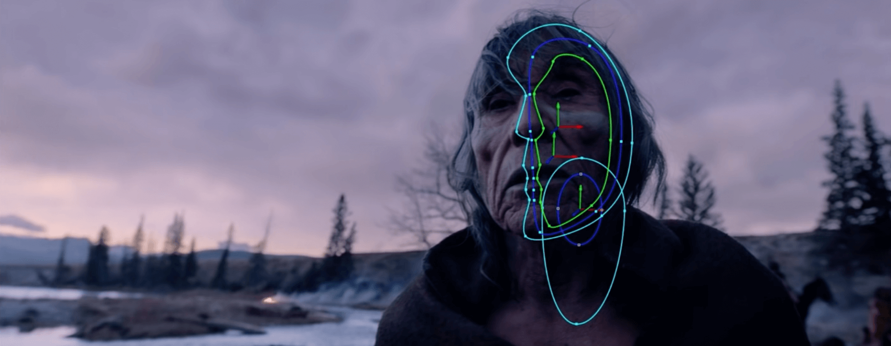
All this talk of the evolution of power windows brings me around to the point of this blog posting. A couple of years ago I came across some fantastic videos that featured Technicolor colorist Steve Scott. Steve has worked on some of the biggest movies to ever grace the screen and is obviously incredibly talented. It was a treat to hear him speak about his approach to grading while working on some of the finest looking movies in recent memory. The video from Variety covering Birdman is a somewhat simplistic overview as to what grading actually entails. But for anyone who is familiar with the process, the part that instantly stands out is how Steve brakes down each image. I had never witnessed such an intense attention to detail while accentuating light. Multiple windows for each face isolated to specific regions (foreheads, cheekbones, noses). It’s almost as if there is a whole animated film underneath the actual movie.
About a year and a half later Steve did another presentation for Autodesk featuring footage from The Revenant. This was a much more detailed look into the workflow that takes place on a movie of such magnitude. Again, I really enjoyed seeing how Steve shaped his shots and took the images further than one would think possible.
It’s quite an inspiration to see this kind of work. I know it opened my eyes. Most people don’t get to see what happens behind the scenes on a super high end movie unless they’re at a place like Technicolor or involved with a studio of some kind. It just goes to show that there is no detail too small and every bit of work counts towards making the image the best it can be.
I agree totally, Rob. Watching Steve’s brilliant work on movies like this made me take a step back and re-examine the whole process of color-correction. The trick for me is to think more from a VFX/compositing perspective than just color alone. I rarely have the chance to relight entire scenes like this, but I certainly now make more of an effort to think about fill light, eye light, and shadows, at least when there’s time to do so.
It’s definitely made me more aware of the possibilities and allowed me to rework some shots that I previously would have passed along to VFX. The line continues to be blurred. The reality is, though, that time and money run the session. The amount of detail that Steve goes into is incredibly impressive, but as you know, that luxury is only reserved to the highest of highest tier. Ultimately viewing the amount of work that goes on behind the scenes in this type of work is a benefit to all of us.