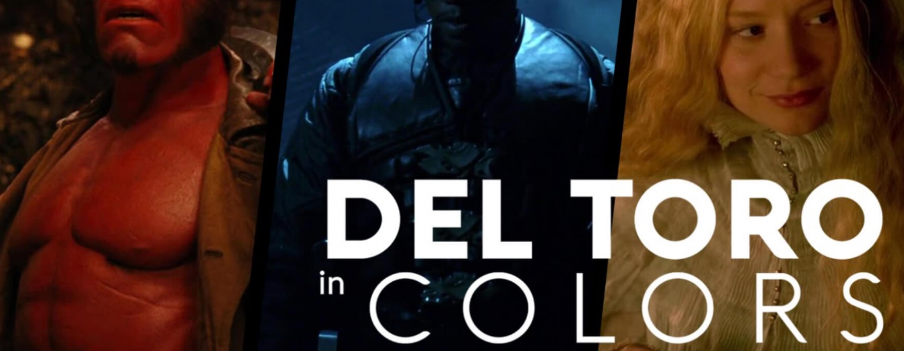
I am a big fan of Guillermo del Toro and his work. One of my all time favorite movies is Pan’s Labyrinth. I’m not sure why that movie resonated with me more than his others, but I just love the images that he captured in that film. Frankly, as a whole, some of his work is a little too “block-bustery” for me, but he always has fantastic visuals. Crimson Peak is another one. I just love the way it looks. He’s not afraid to be aggressive and his treatment of colors are beyond compare.
So when I randomly found this Vimeo link, I was quite excited to see his work compiled and organized in terms of color. It’s really fun to see the production design, color correction, makeup, and wardrobe all work in tandem to help tell the story. This video is a visual lesson showcasing the importance of primary colors in storytelling and how combining them maximizes color contrast and enhances the image even further.