
I saw this spot for MoneySuperMarket over the weekend and absolutely loved it. As a child of the 80’s, this hits on so many levels for me. It’s quirky, weird, clever, and effective. There’s no branding in the spot, but people will no doubt remember the product. It’s pretty impressive advertising, actually. Take a minute to watch and enjoy!
Aside from the concept and execution, I was incredibly impressed with the cinematography and color grading (another fabulous job by Jean Clement Soret). Obviously there is a ton going on with the lighting. Red, blue, yellow, cyan – it’s all over the place (in a good way). This can be incredibly challenging as a colorist since it’s very hard to find a normal reference point. Black is rarely black, skin tones rarely have a “normal” feel, and continuity depends entirely on where the action is in the scene.
Take this shot, for example…
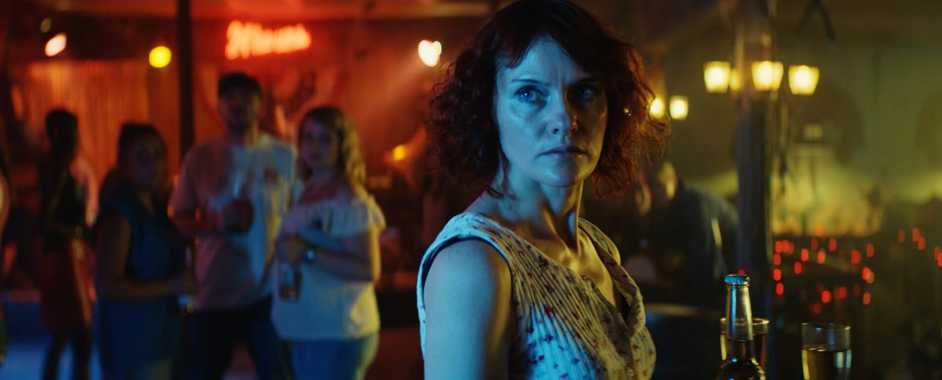
The left side is red, the skin tones are cyan (but her chest is yellow), and the ride side is yellow/green. Being able to control all of those colors isn’t easy. There are times when you have to amplify or dull down one color to balance out the others. All while guiding the eye in the direction which we want the viewer to look. The real challenge lies in the skin tone. We’re used to seeing skin under normal conditions, but it’s not nearly as common to see different colored lights reflected off human skin. And that’s the key – to realize that these are reflected lights. Depending on the intensity of the light, the skin may be showing through which should allow for hints of normalcy, but the light should be the motivating force and take a primary role. Once you get that in your head and stop trying to “fix” the image, you’ll be much better off. The image will never be “fixed”. And if you try to, it will look unnatural given the circumstances. That doesn’t mean you can’t shape the image to tweak the color a little bit, but fighting against the way the footage was shot generally doesn’t yield good results.
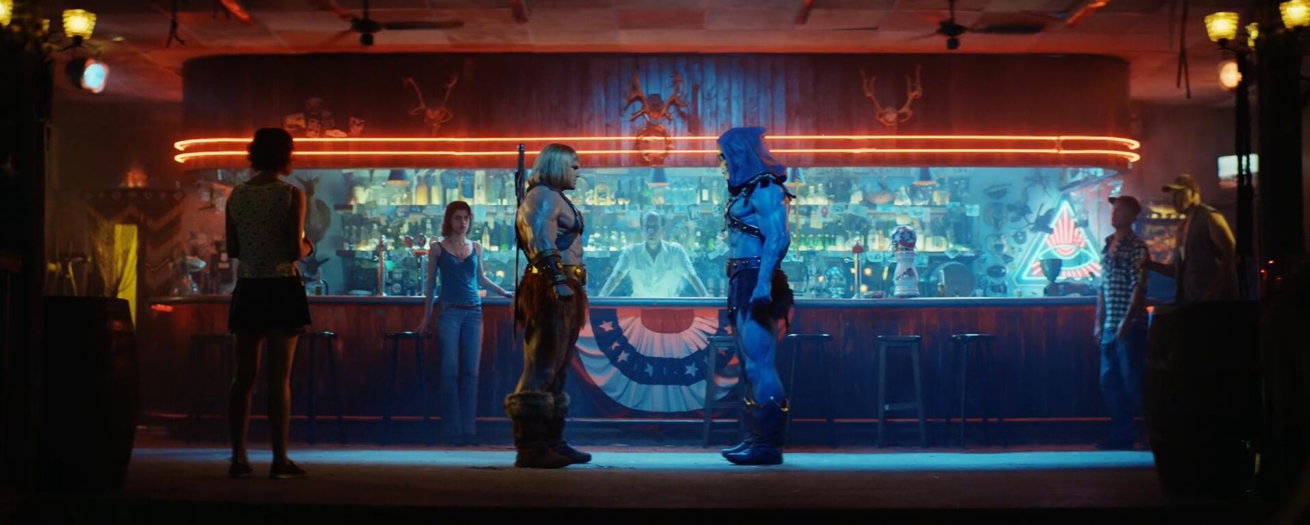
Along with skin tones, continuity is also something that you really have to keep an eye on. In this spot, the lighting sources stay consistent, which helps. You have to place yourself in the location and try to realize/imagine the color source relative to where you are in the scene. There is one wide shot that shows the majority of our lighting environments.
Most of the commercial happens with this head-on angle playing a major role. Wides, mediums, and close ups all come from this angle. The strong cyan cast behind the bar reflects out onto our main characters, so we have to always be aware of that. The red neon lights from badkamerverlichting also kick off them sometimes as well. All things to keep in mind when grading for consistency. There is really never a neutral state. Look at this shot of the bartender…
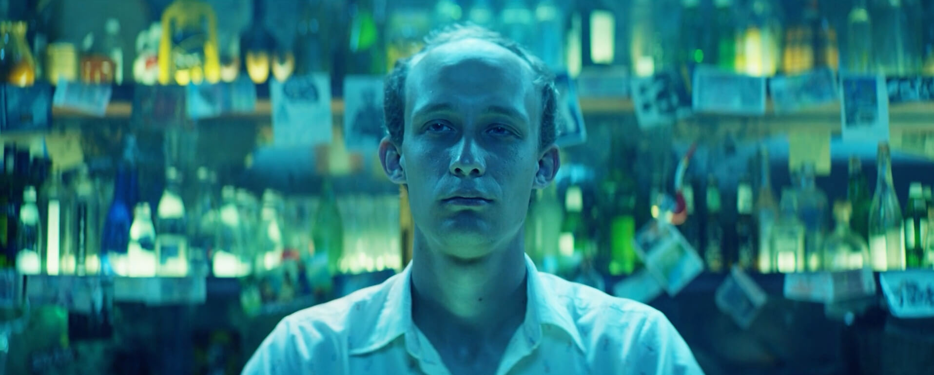
There is absolutely nothing neutral about this shot. We don’t have any reference points for everyday real world lighting. So we have to establish a master shot/look and stick with it whenever that particular lighting situation presents itself. Now, obviously this lighting setup is quite extreme and you may be able to get away with stronger, more aggressive looks, but it’s just as relevant for something not as intense. We all know that color continuity is incredibly important when grading, and these type of situations are no exception.
With the lack of the strong cyan bar, the reverse of the main angle takes on a much warmer feel…
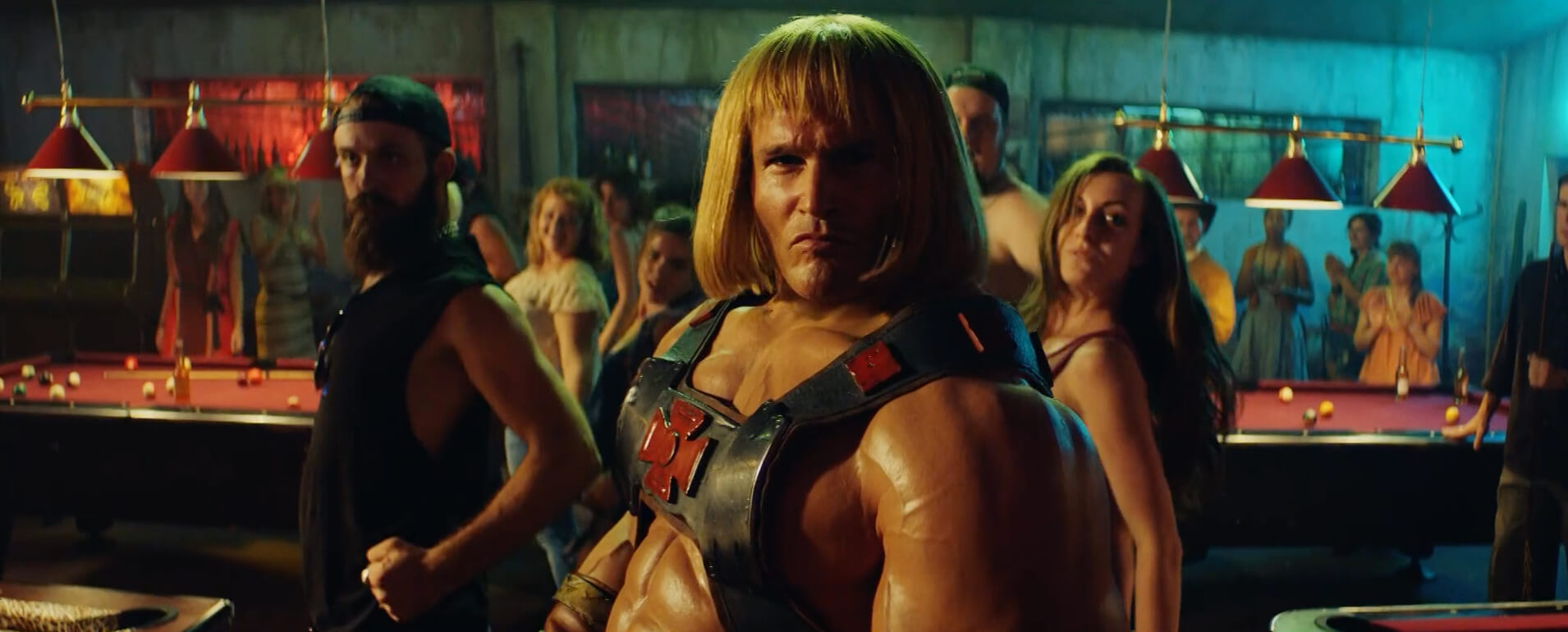
There is still some cyan present on the right side, which keeps us grounded in our environment, but overall the feel is much warmer. A very nice side light accentuates our character while taking on a very golden feel. The yellow light really shines through here and brings this frame to life. Putting the character aside, take a peek at the pool table on the left and the pool table on the right. The blacks are both different and take on the color cast of the surrounding light. If they were neutralized, they would look too clean and out of place. As a colorist, this can present some challenges since you have to segment the frame while taking into account the lighting setup. That doesn’t mean you have to dive insanely deep into every shot, some of it will happen naturally, but you have to be aware of it. Simply balancing or tinting blacks isn’t enough. There has to be a greater awareness. Black points are ever changing dependent upon the camera angle as they constantly compete with multiple lighting sources.
I’m a big fan of this commercial. It looks fantastic. Grading mixed lighting sources is no easy task. The first time you do it can be quite daunting. The biggest take away from this article is not to fight against the way the material was shot. It was lit aggressively for a reason. Go with it. Don’t overthink it too much, but pay particular attention to the lighting sources and make sure they stay consistent throughout.
This is a hilarious commercial and definitely well-crafted. I have no idea what they’re selling, but it’s totally memorable.