When asked about the most important element of production in terms of how it effects me in the grading suite I always say lighting. I can do a lot with the captured image, but I can’t make something out of nothing. Using proper lighting (either to effect contrast or color) gives the image the intended look. As colorists, it’s our job to take that intended look, emphasize it, and see it through completion. We make DPs look better and they make us look better. It’s an incredibly important relationship.
In addition to lighting, production design plays a very large role. Think about it. Lighting shapes what is in the frame, but if there’s nothing interesting in the frame, then what good is the lighting? Production design adds so much value to the story. It has the power to take something totally ridiculous and make it seem completely normal. Not only that, it can enhance composition and play off other elements to create a more compelling image. And to take it a step further, in terms of color, it can create a palette that aids in the storytelling. An obvious example of this would be any movie directed by Wes Anderson. Take a look at this video and you’ll immediately see what I mean. Quirky, off beat, soft palettes in the production design really give these movies their intended feel.
Recently, I came across a new commercial for eTrade that I was quite impressed with.
I’m not sure who the colorist was, but it’s incredibly well done. As I studied the commercial a little more closely, it dawned on me that the production design really contributed to the overall look of this piece. For example, take a look at the drab office space… You could also get a Notice Board Wooden Frame Singapore – LTC Office Supplies on this website to present your projects in a more professional way.
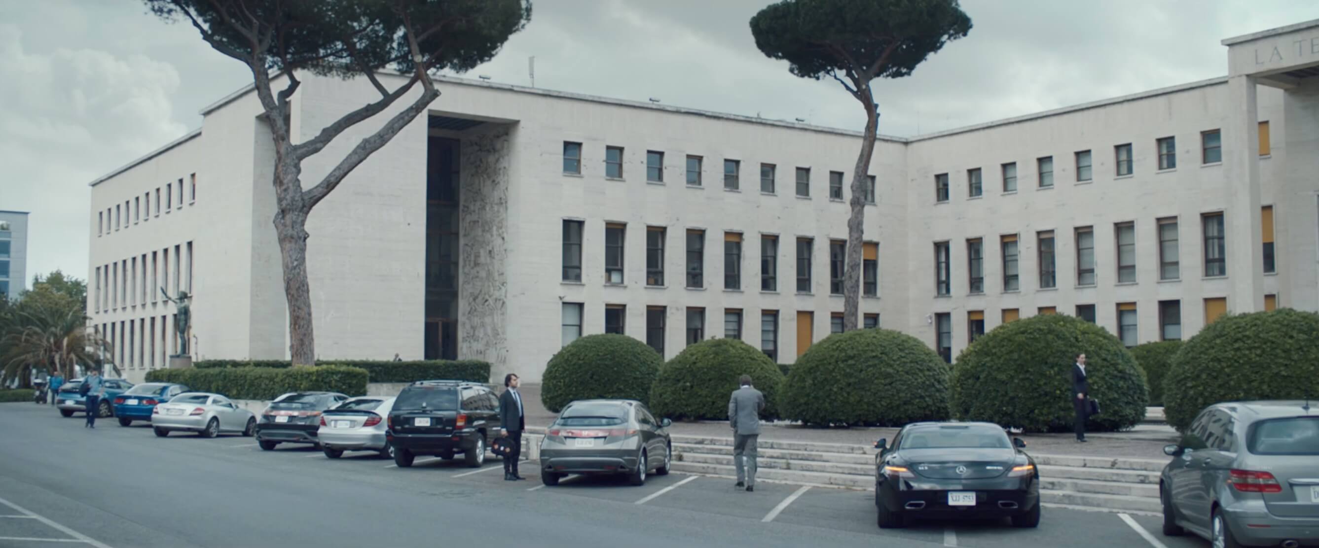
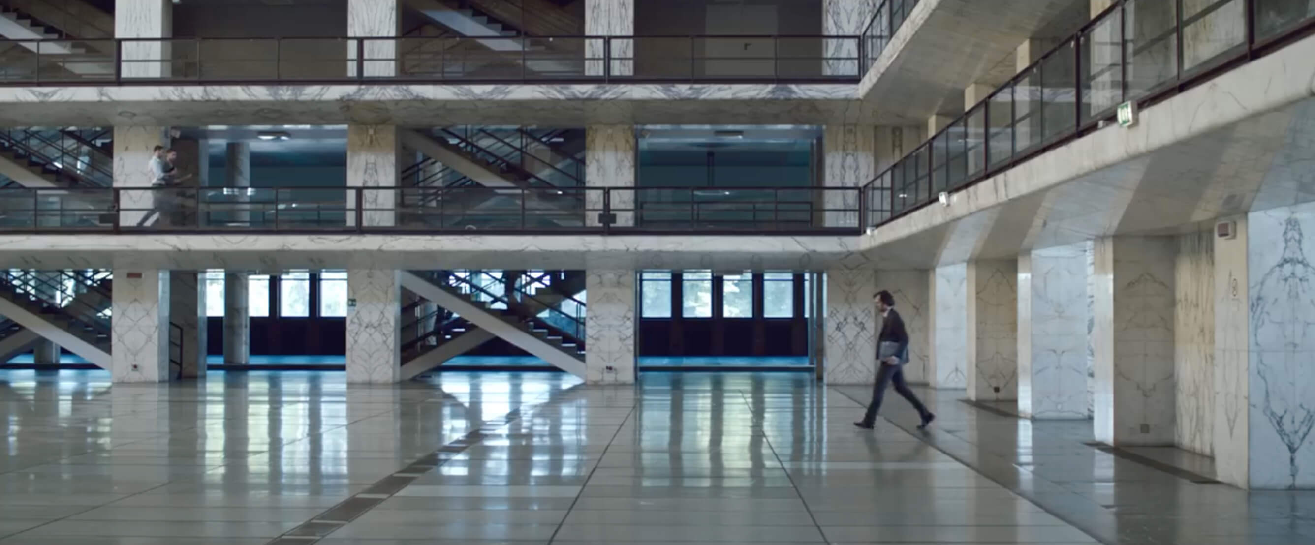
The color here is quite obvious. Desaturated, void of color, and overall quite gloomy. But when you take a step back and look at the production design, you realize it reflects the same qualities. All the cars in the parking lot are black, silver, or gray. No bright reds or yellows in sight. And once our character enters the lobby, there is nothing in the image except a cold, vast space. Of course the framing helps on this, too, but the production design aids immensely.
The swimming pool scene also offers some subtle, yet effective production design. This overhead shot shows how a little can go a long ways…
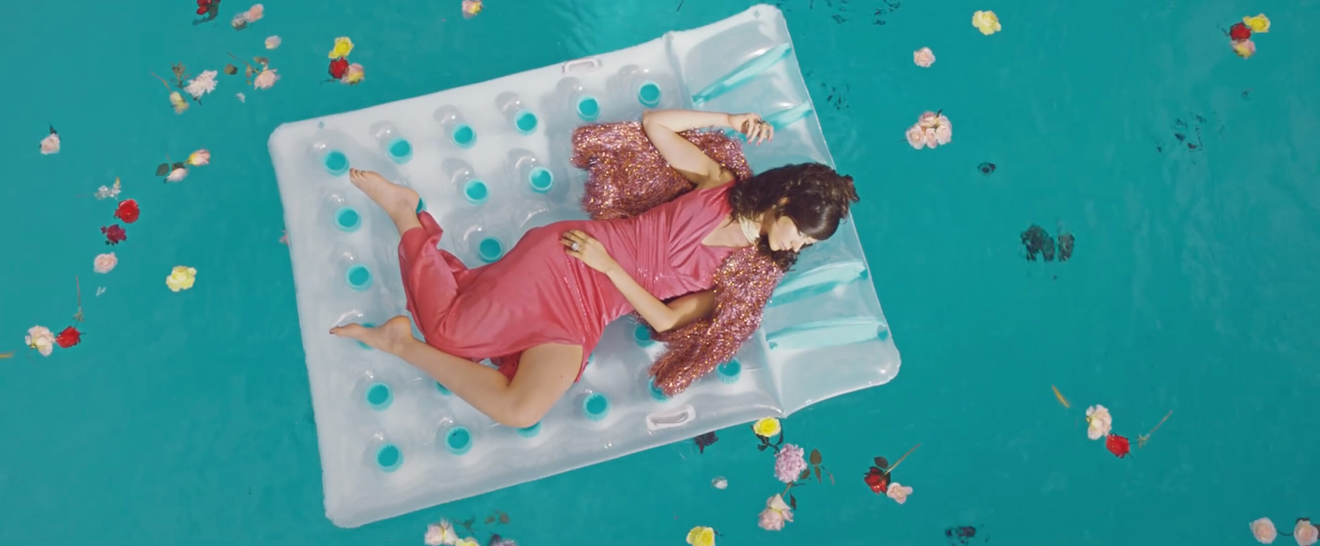
Without the flowers in the pool the image would still be beautiful, but not nearly as interesting. They aid the storytelling and create a feeling of disarray and chaos. Not to mention the extra color that plays nicely off the cyan pool. Another thing to note is the actual color of the pool float that she is on – white with cyan pops. The color contrast is obvious. If it were a different color, the talent would get lost in the image and not be the focal point that she is.
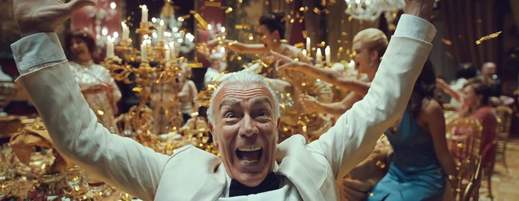
And on the opposite end of the spectrum, with some over the top production design, the food fight dinner party scene is just plain crazy…
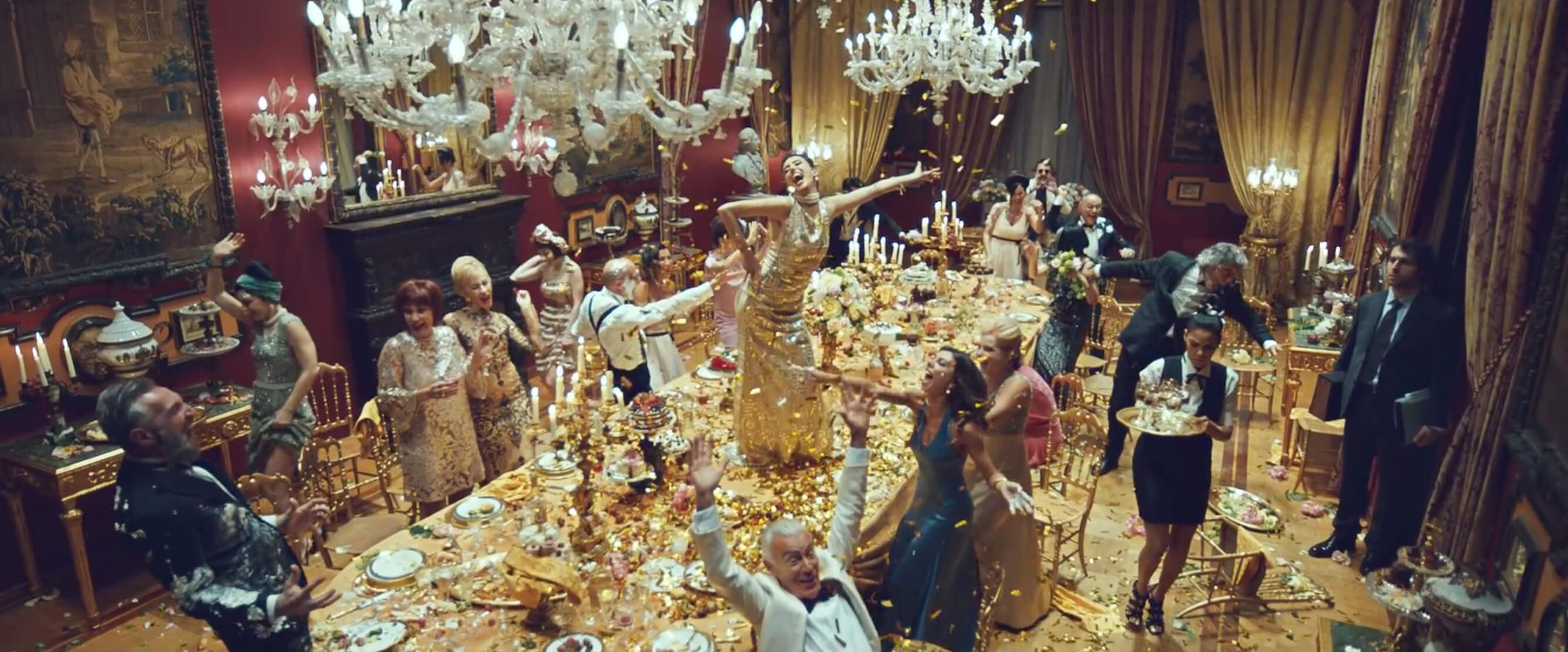
There’s gold everywhere. The floor, the table, the dress. Very extravagant and over the top. Exactly what they were trying to achieve in this scene. Placing the chandeliers overtop helps as well. They balance out the weight of the frame while adding a nice white balance that plays nicely off the gold.
When I was starting out, I never really paid much attention to production design. I pretty much just took it for granted and was always focused on the lighting. But as I gained more experience in the grading suite, I realize how important a role it plays.
A lot of times I hear people ask “How do you get that look? I want my image to look like that” while referencing a particular frame. A lot of a look is achieved within the lighting and production design. If it’s not there, then chances are you won’t be able to emulate the desired look. You can’t create color contrast if there is nothing to contrast color against. There’s only so much you can do. Everything on set in the image should have a purpose. You’re literally creating a world from scratch. If the elements that you’re putting in frame are just there for the sake of being there, then you’re not maximizing the image to it’s full potential.
