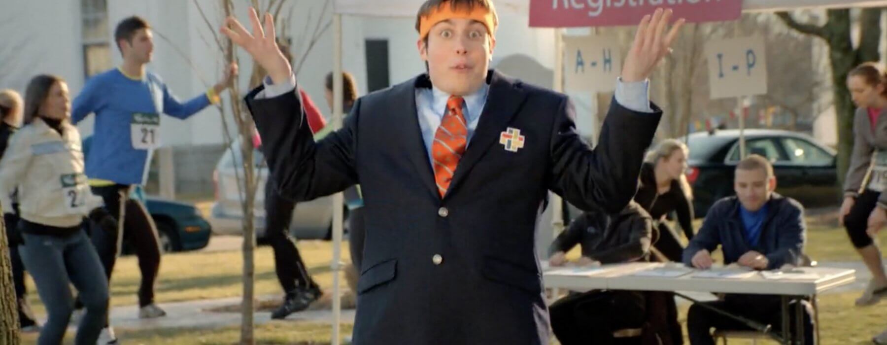
While watching television the other day, I saw a commercial pop up that I graded over six (!!!) years ago for a local health insurance company. At first, I was pretty shocked to see it since I graded it so long ago, but then, as I tend to do, I immediately started to analyze the commercial and try to learn from it. Looking back at it with fresh eyes, there were a handful of things that I would have done differently if I were grading it today. Take a peek below at some of my first work while running a color suite.
Now, I’d like to think that my skill set has vastly improved since 2011, so some of this I might chalk up to a lack of experience, but to me, this commercial could have been taken a lot farther in terms of color. There’s no real “look” to it. It’s pretty much just a standard balance job with relatively high saturation and a little bit of selective windowing. Nothing out of this world as far as the color is concerned.
In hindsight, I was too tentative. Too afraid to push the color past it’s breaking point. Early in my career, that was probably my biggest fault. Being too passive. Trying to perfectly balance everything. When in reality, nothing interesting really ever comes from that. Color grading is about pushing the envelope and taking adventurous risks with footage that can lead to something spectacular. If you don’t try to push it, you’ll never realize the full potential of the footage.
If I had to do it over again I would have gone much deeper into the midtones and compensated with raised blacks to balance out a nice, smooth transition between the two. The footage was shot in the dead of winter with no foliage to play against, so I think a nice blue tint while maintaining skin tones would have worked quite well. Also, the orange headband was a brand color, so having that isolated against a cool blue would have provided for some very nice color contrast.
Now, as 2017 comes to a close, my goal for every job that comes through the door is to leave no stone unturned. I do my best to quickly push the color in all directions to see if anything sticks. You’d be surprised how quickly you can brainstorm ideas when you see something that you weren’t intending to see. Sometimes it works for the project, sometimes it doesn’t. But at least you’ve explored all avenues and have not painted yourself into a corner before you’ve even started. And even if it doesn’t work for that particular project, it might be the perfect fit for another down the road or help lead to some new ideas.
Take a look at this spot below that I did for Adidas and the NHL. No way in hell I would have had the courage to do something this bold back in 2011. If I colored this back then, the ice would have been pure white and everything would look perfectly balanced. I think we’d all agree that the final result is much more interesting.
It’s always a tough call when to be aggressive with color and when to play it safe. Especially if the client is a little hesitant to go abstract. Sometimes a balance job is all that’s necessary and there’s no need to over complicate things. But as a colorist, it’s my job to present options and think outside the box while offering up potential looks that can further sell a product or tell a story. As long as I’m aware of the possibilities and potential that the footage holds within it, I can do my job to the best of my ability. I strongly feel that to further yourself as a colorist it’s important to analyze, study, and break down past work. It’s helped me learn from past mistakes and realize my shortcomings. Taking a step back and being honest with myself has given me the ability and confidence to do my job better in the present. I wonder how I’ll look back on the footage that I’m coloring now? Time will tell.
