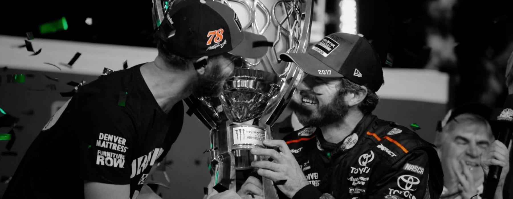
I recently came across this post from Little Black Book and really enjoyed it. It hits close to home and echoes my sentiments on a project that I just wrapped. Over the last couple of months I have been doing an exciting campaign with NASCAR and Trident Post Production. So far we have completed over 15 spots with more coming later this year. It’s a lot of content, but in the world of sports, you have to stay current. Major kudos to all the teams for staying organized and on top of everything. It’s no easy task. Take a peek below at one of the spots we recently completed…
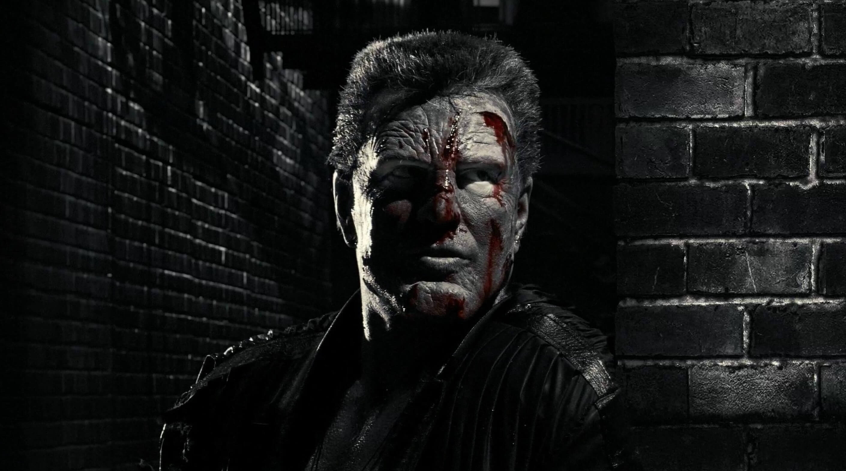
All the spots from the campaign have this treatment – black and white with specific colors showing through. For each driver we chose a color that best represents them and show only that color every time they appear on screen. It’s been used several times in the past and is more commonly known as the “Sin City” look.

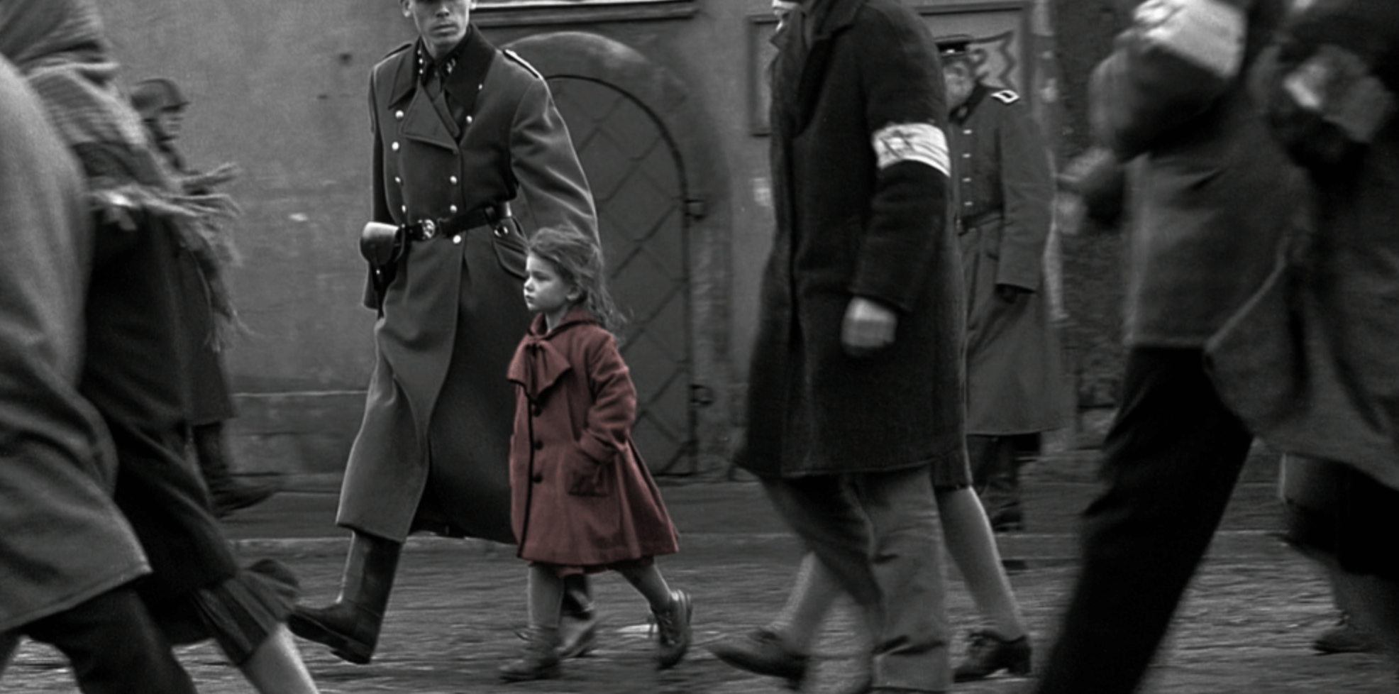
For anyone not familiar with the process, it basically involves grading the image in black and white while retaining the desired color information and allowing it to show through in order to create a dramatic impact. The first time I recall it being done was in Schindler’s List (perhaps there are earlier examples?). It was an incredibly powerful moment in cinematic history.

Communication with the post team was a critical part in making sure this campaign went smoothly. We had to decide what color we wanted for every driver/car and when to highlight them. If we were unable to make up our mind, we’d deliver multiple passes for flexibility in the online. Once that was nailed down we discussed which shots we’d need rotoscoping for. Some shots I was able to easily mask out on my own. But for the majority of the shots, it was simply impossible. Too much work/time and not as effective a result as if it were done with external mattes.
My process in grading the material was fairly straightforward. I’d go through every shot and do a base grade in color. Basically a balance job with contrast and saturation. During this pass I made sure to separate colors as much as I could, all while retaining as much information as possible. So once this pass was completed, the piece would look as if it were a somewhat finished spot, but all in color.
Next, I would append a node to each shot and in the RGB Mixer tab check the “monochrome” option. This would allow me to turn the image black and white while having control of the intensity of each red, green, and blue channel. I would then start grading in black and white while managing contrast, and shaping the image. Working in this manner allowed for more flexibility than simply turning the saturation down to zero. I found it especially helpful on skin tones and would recommend it for any black and white work.
At this point I had a very nice looking black and white image, but I still needed to pull the color through. So in each case I used a Layer Mixer node and connected it back to my original color balance node. From there, I’d normally use an external matte to isolate the region that we wanted to focus on and work the image over with windows and hue vs. sat curves. In some instances I had to use HSL qualifiers and a little of my own rotoscoping to remove an undesirable color that I couldn’t remove with curves. If the color coming through wasn’t exactly what I was looking for, I would tweak with LGG controls until we were happy with the result.
The biggest challenge while working on this campaign was trying to keep everything cohesive. To make it flow from shot to shot and work in a manner that seemed natural and didn’t distract the viewer. Since each shot was treated so uniquely, I had to take a step back and make sure that everything worked together as a whole. So once I had gone through with my isolated color pass, I’d put that portion of the job in the back of my mind and try to work in a more traditional manner. I really wanted the spot to move smoothly from one cut to the next while helping guide the viewers eye. It was a nice fine polish and I ended up catching some stuff that really helped the final result.
Ultimately, it was a very fun job to work on. Organization and communication played a huge role in making sure everything worked properly. On several shots I had numerous mattes. Each matte had to be properly labeled, lined up, and QC’ed. There was no room for error. A slipped matte would show color in regions that were not supposed to be shown and could easily ruin the desired effect. So I would put shots on loop and just stare at each region until I was satisfied with the mattes effect. Sure, it was a little painstaking and not very fun, but it yielded a better result because of it. Sometimes grading is not as glamorous as it seems! But attention to detail can make or break a job and nothing cheapens your work more than an easily fixable mistake that was an unfortunate oversight.
