When color grading black and white I have to get myself in a different mindset by thinking about areas and specific regions of contrast while maintaining the integrity of the shot. It’s a lot easier said than done. One of my biggest pet peeves is when someone thinks all that has to be done is turn the saturation down to zero. Hmm, I wonder if that’s what photographers like Ansel Adams thought when they were in the dark room. “Eh, just throw it in the bath. I’m sure it will come out fine”. There is an art to black and white color grading that goes far beyond saturation.
Recently I was lucky enough to team up with local production company Minder to color a spot for Santander Bank. The biggest challenge was making the time of day continuous. I really had to utilize the pivot and contrast controls to achieve the desired contrast levels while maintaining detail in the highlights and shadows. I also graded my primary layer in color so I could grab certain areas with my HSL qualifier that I would not normally be able to do in black and white. It definitely required some outside the box thinking, but when all is said and done I was pretty happy with the outcome…
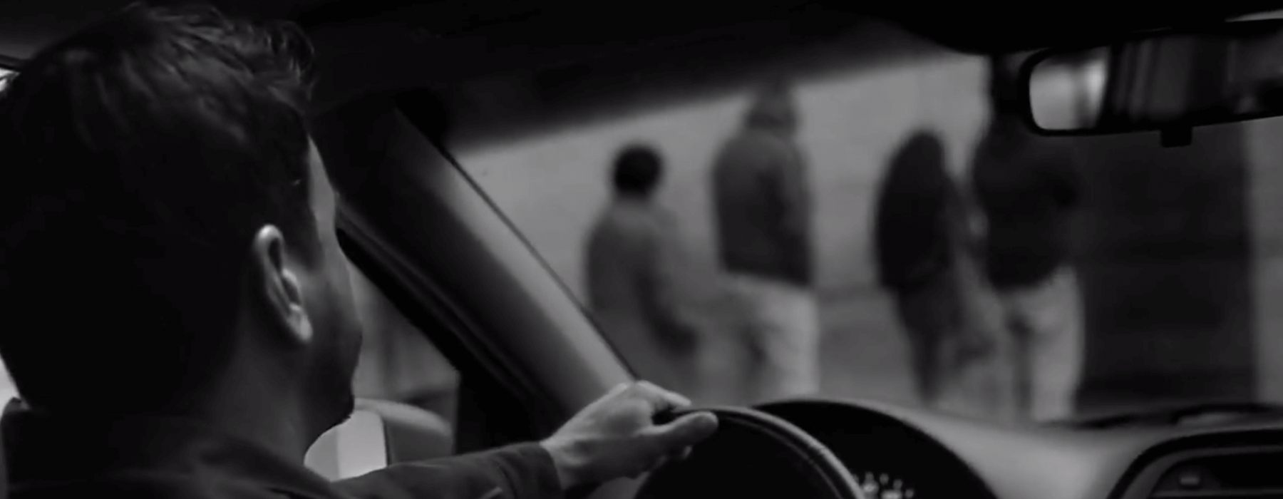
Here are some other inspirational black and white commercials that are beautifully color graded. Just a little more went into them than zero saturation…