
Sometimes in the color suite the desired look has already been established before the grade even begins. Repeat campaigns, real life product representation, and classic looks all have a predetermined starting point that we do our best to build off of as colorists.
The Peanuts Movie recently opened in theaters and does a fantastic job honoring the long time classic Sunday comic by Charles Schulz. This article offers an interesting insight towards the creation of the look and the challenges that the creative team faced while trying to bring the beloved 2D characters into a 3D space. The unique look that has become engrained in American pop culture doesn’t really follow the norms of what is theoretically “correct” in terms of anatomical representation. For example, when you see Snoopy in profile, you often see both of his eyes. Little nuances like this became a challenging issue for animators who had to manually account for these type of abnormalities since computer software wasn’t exactly able to decipher the intended effect.
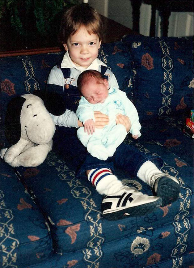
Along with the animation of the film, the color of the film is of the utmost importance in order to achieve the desired look of the classic. Natasha Leonnet of EFILM did a great job in maintaining Schulz’s vision while working in Autodesk Lustre. I’m sure it was not an easy job since so many people hold these characters very dear (myself included, the pic below is me and my sister in 1986) but she nailed it. I took my children to this movie and it was an amazing experience to share with both of my boys.
It’s a fascinating look at the creation of the movie and I applaud the entire Peanuts team for their dedication towards honing a classic that so many know and love.