Lately I’ve had to come up with a lot of creative looks in the color suite that depend on how the black levels are treated. The lower end of an image can really help determine the overall look and feel of a piece with some detailed finessing. But it’s not just about the shadows. How the midtones roll into the shadows are an integral part of creating unique, memorable looks.
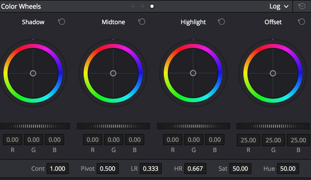
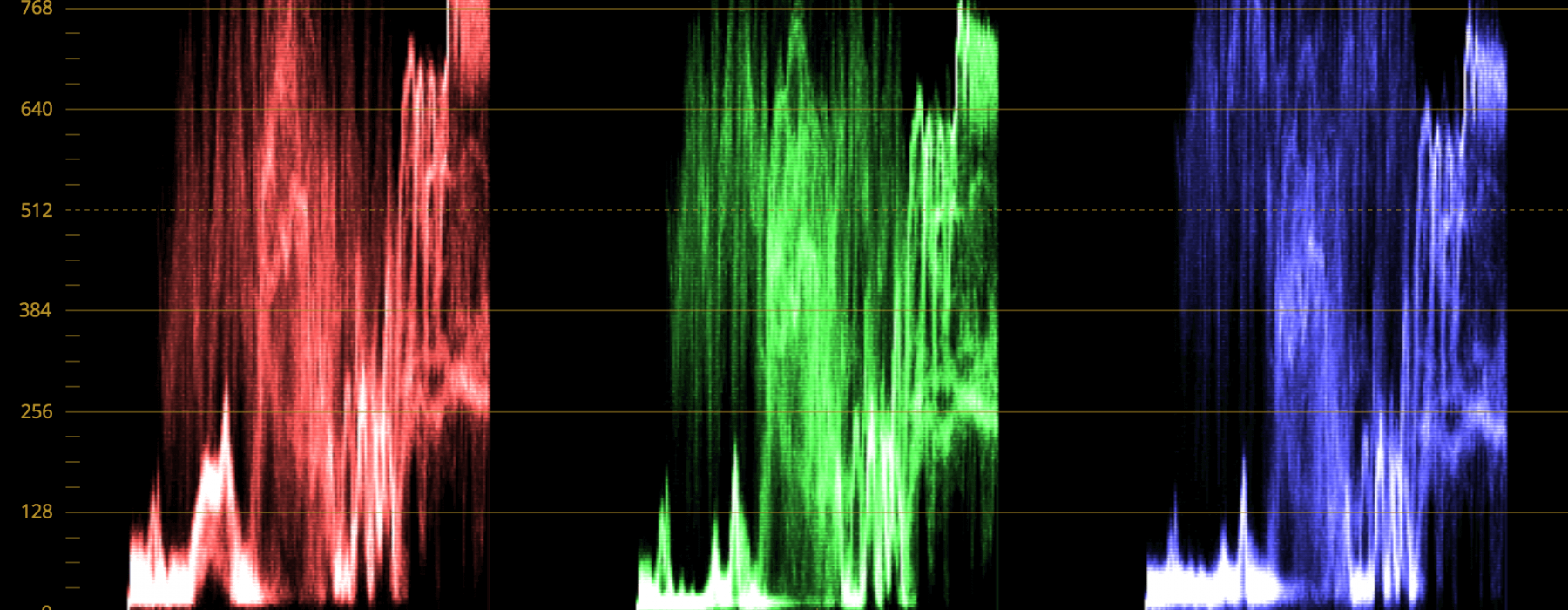
Lowering the shadows just brings the black levels down as a whole. It’s a uniform move that brings everything down equally. Think about your waveforms when performing this action. The lower half just goes down. So what do you do if you want the top end of the shadows (or the lower end of the midtones) to move down more than the bottom end of the shadows? You move the midtones down and compensate the difference by moving the shadows back up. It’s this back and forth, give and take, relationship between the two that really needs to be explored. Try moving the midtones way down to give you a nice, dense feel and then finish the rest of the image off with some shadow treatment. You’ll see that the image bulks up around the shadows and is more condensed on the lower end. You can also play with this relationship by manipulating the low range controls in Resolve’s log grading tools.
 The LR controls can help you get in between the shadows and midtones with more detail.
I find that being in the mindset of how to dig deeper into the image further is the key. It’s more than just lift, gamma, gain. It’s everything in between. Get in between those controls and now we’re talking. Massage the image. Manipulate it and pay attention to your scopes while doing it. Get some nice depth and retain all that shadow detail. It can be very rewarding when done properly.
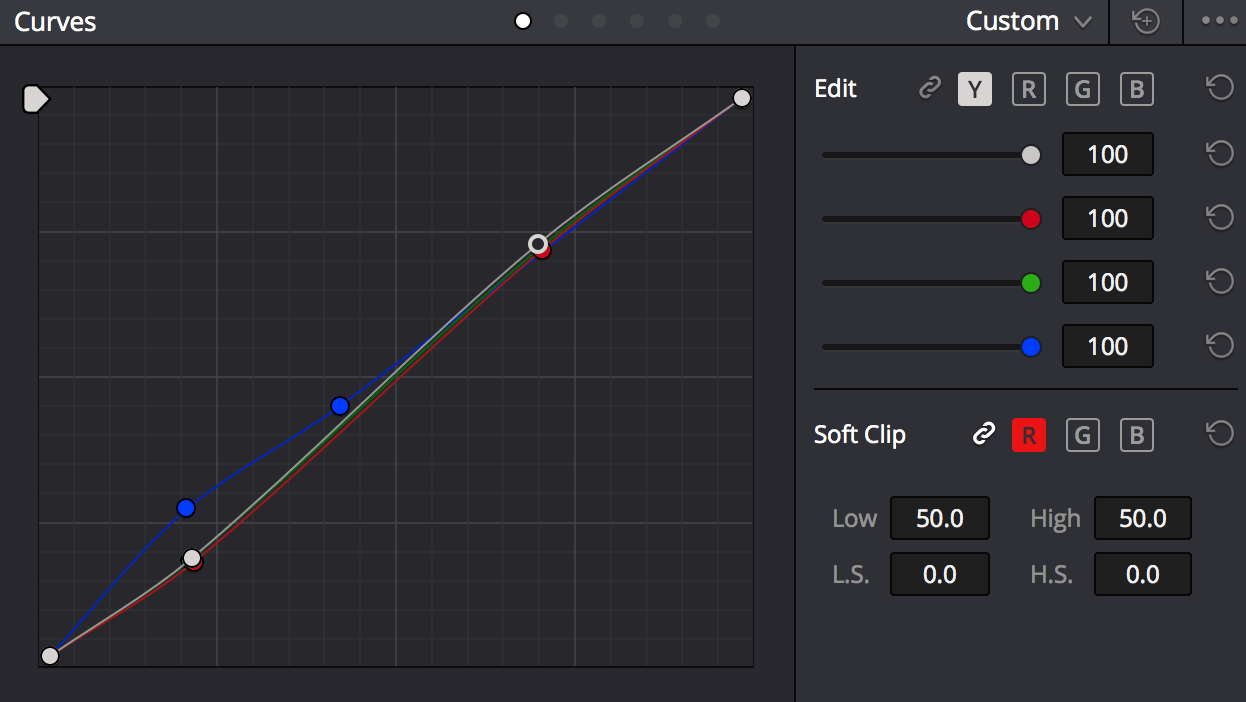
Now that’s not to say that creating depth in the shadows works for every image. Different pieces call for different treatments. And one of the most popular treatments is to tint the blacks. I find that the curves work great for this. While using the curves you can have a very nice fall off into the midtones that allow for a nice smooth transition between the shadows and the midtones. By un-ganging them you can really see their relationship. Cyan blacks are well balanced with yellow highlights. You can be subtle, or extreme. But don’t create a look just for the hell of it. Have a purpose. Red, yellow, or orange blacks tend to make things feel a little hot, humid, or sticky. But be aware of consistency. If you’re creating a look, commit to it. After the audience sees one or two shots it shouldn’t feel like a look to them. It should feel normal and almost go unrecognized to the average person. If you deviate from the look or start to drift, it will surely take their attention away from the piece.
 Un-gang the curves to allow for better midtone roll off when tinting shadows.
 Warm tinted blacks rolling into midtones create a hot and sticky feel.
And of course there are always raised shadows. If you want to maintain some depth, go to the midtones. Use that to get the lower end working a little better for you. Two or three years ago when log acquisition became popular blacks and midtones were raised to create a very flat image. I’m finding that look to be less in demand these days and most people are liking midtones lowered to give the image some weight to compensate for the raised blacks. Or you can do some soft clipping to create an artificial clipping points that gives a different look. I generally find that when someone requests an “Instagram” look this is what they’re referring to.
Either way my take home point from this ramble is that you should think about how the two controls relate to each other and use them in tandem. Not as separate entities. By using them together you can come up with some really impressive looks that take your work to the next level.
