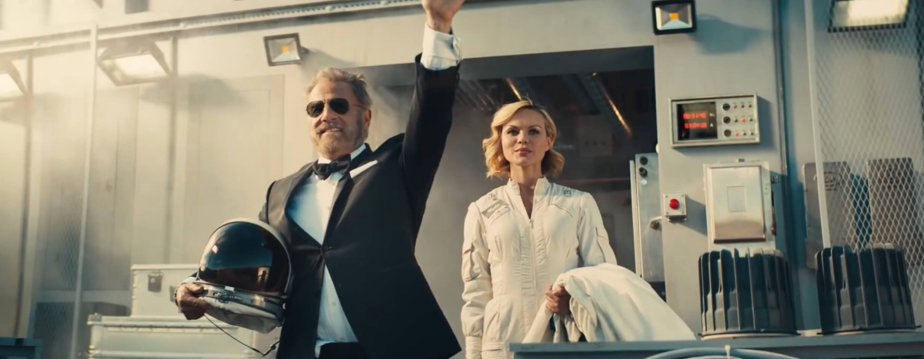
Over the past 10 years one of the most identifiable campaigns has come from Dos Equis and “The most interesting man in the world”. Havas Worldwide executed an extremely clever, unique, and sharp campaign that has been called one of the best of the 21st century. Just this past week Havas announced that they are headed in a new direction and swapping out their lead character, Jonathan Goldsmith. Details have yet to be announced, but it’s a major shift in the product’s promotional direction. Knowing the talented folks at Havas, though, I bet they have something great up their sleeves.
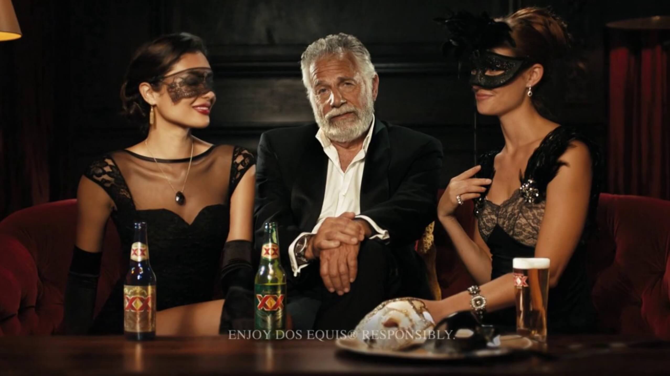
Colored by Tom Poole at Company 3, I can only imagine how fun these must have been to grade over the last decade. The spots regularly featured some sort of filmic treatment. Heavy grain, light leaks, sprockets/gate jumps, etc. The only clean shots really happen when we are in present day and during the end tag while our hero delivers his trademark line, “Stay thirsty, my friends”. I find it rare that clients go for these kind of treatments since they tend to deter from the branding at hand. But when they do, it’s generally quite effective. Tom has a great eye for generating these type of looks and replicating all sorts of film stock. The campaign covers different eras and locations that lend themselves to several types of styles, looks, and stocks. I’m not quite sure how they went about filming these commercials, but I bet there were some interesting conversations in the color suite when creative direction needed to be addressed. It really is fantastic work and shows us as colorists how important it is to know how film looks and how it reacts to certain treatments. It’s not something that we come across everyday, but it’s definitely something we should have in our repertoire as a creative toolset.