Earlier this month I was approached to work on a “fashion music video” that was used to release a new song while highlighting the Christy Dawn clothing line. Definitely not something that you come across everyday. I saw some of the raw footage and checked out the rough cut. It had a lot of potential – so I jumped on it. I was told by the client that they want the vibe to feel vintage, filmic, and warm. They also mentioned that there was a lot of room for some creative color. All things that I like to hear when approaching a video like this. I should also mention that this was all to be done remotely.
So they let me have a crack at a couple of shots as we started to brainstorm. I really wanted to achieve a very authentic feel that looked like 16mm. I thought it would be perfect for the piece. So I worked the image over and came up with some nice golden highlights, some tinges of blue in the blacks, a little glow to the brightest areas, and added some heavy grain on top. I was quite happy with the look. Here is the result…
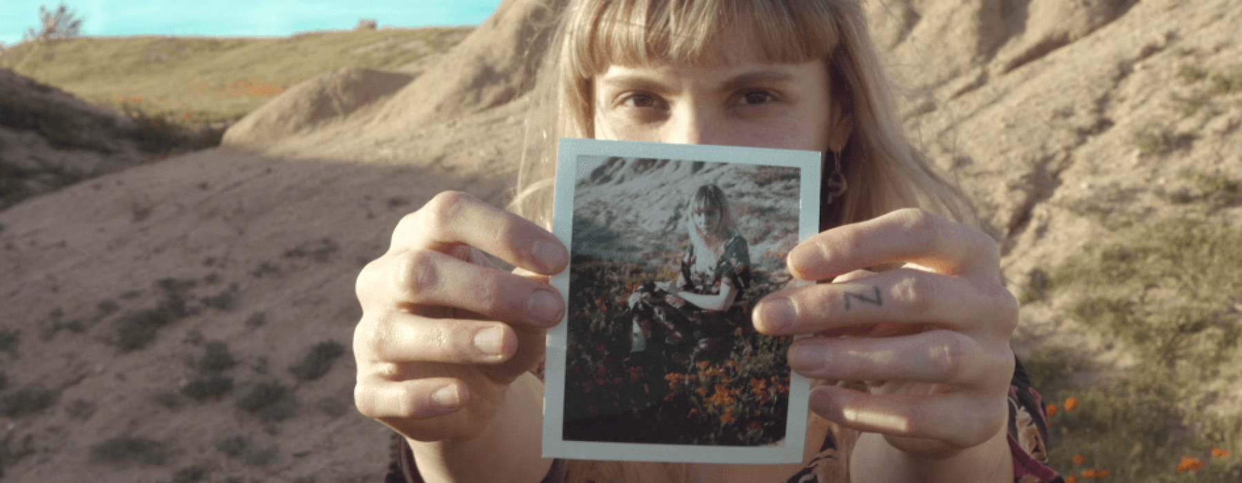
I felt like it achieved everything that they were looking for when they described what they wanted (vintage, filmic, and warm). But when I sent it along for approval, they instantly pushed back. They commented that it wasn’t representative of their brand. The director forwarded me some images of what they were looking for and it was pretty obvious that I wasn’t even close…
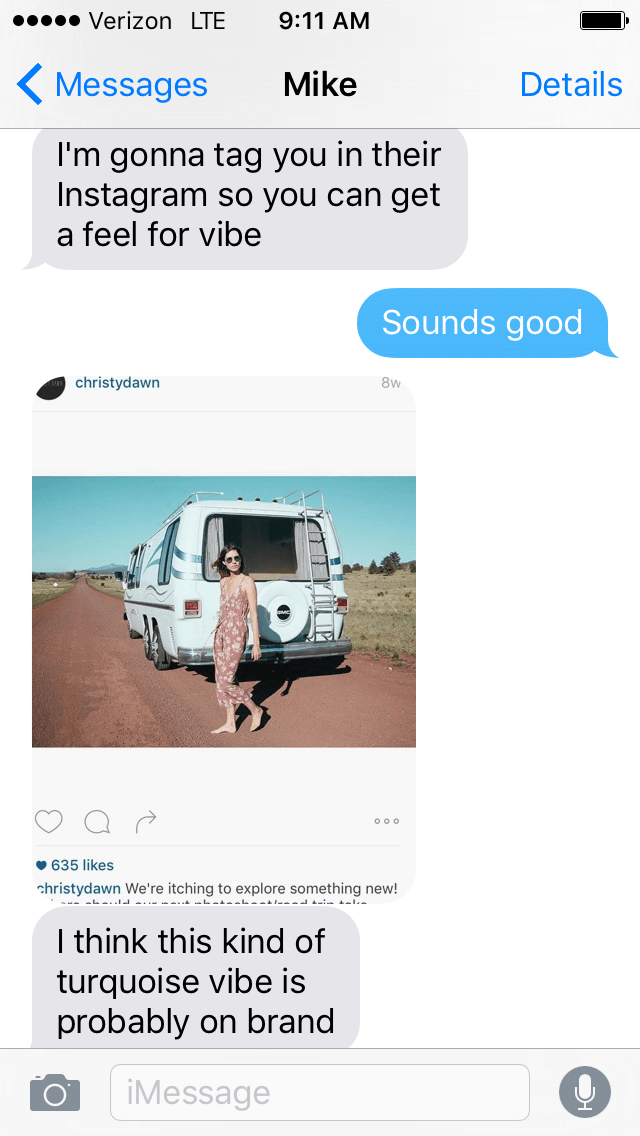
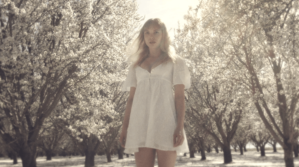
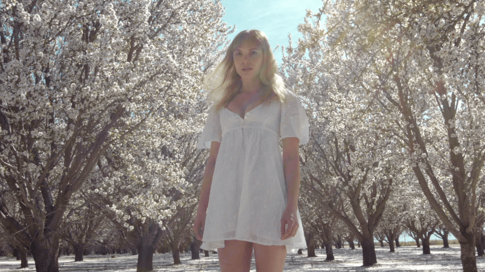
What was described to me as vintage, filmic, and warm I didn’t see at all in their pictures. It felt more polaroid-like to me. But as I scrolled through their Instagram page and tried to get an idea of what they were all about, their look became pretty apparent. The cyan skies, lifted blacks, and cooler whites were all part of their brand. So I came back with this look and they signed off…
Adjectives to describe color can be so subjective. That’s part of what makes our jobs as colorists so challenging. Who is to say what one person perceives as “vintage” is what others perceive? Do we all see color the same? Have our past experiences led us to associate certain adjectives with specific looks that might be different from others? The only real way to solve this is to communicate through reference stills or product. I always try my best to get some sort of idea as to what the client is looking for before we get started. Normally there is some sort of inspiration. Another commercial, a print campaign, or the actual product itself are all very helpful things to have before moving forward.
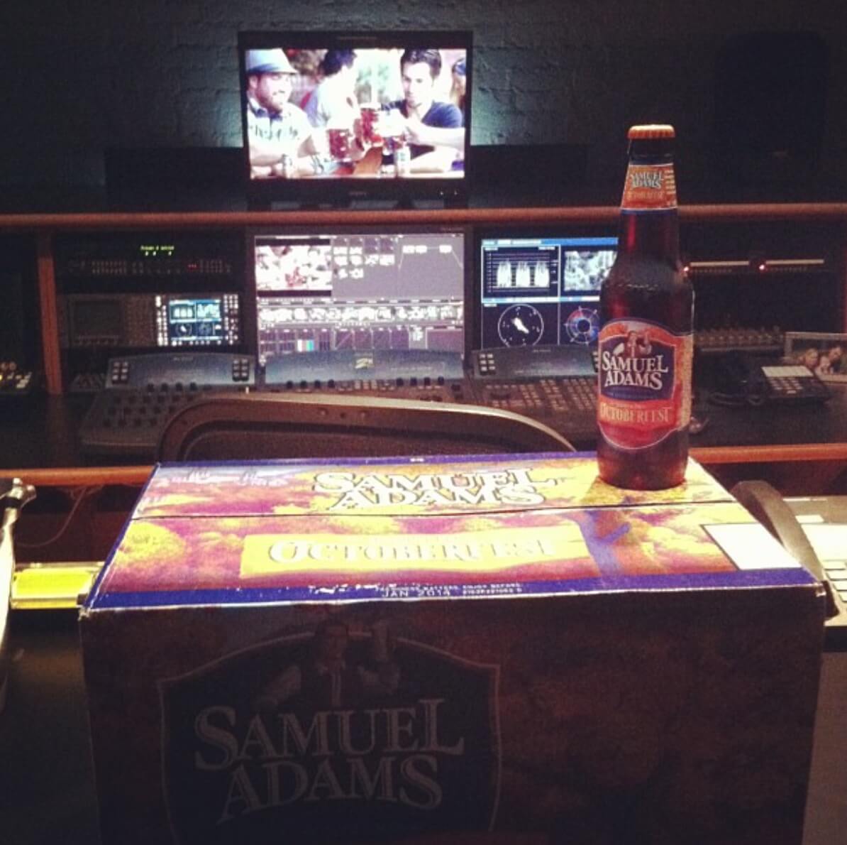 (Every job I do with Sam Adams they bring in packaging and bottles as reference product. We pour a glass and look at the liquid to make sure that we are accurately representing their brand.)
Sometimes a client doesn’t know what they want. Then it’s my job to give them options as to what I think would work best for them. At that point I dig into an “inspiration folder” I have that consists of images I admire and would do my best to replicate. Obviously the subject matter has to be fitting, but I find more often than not I have something that tends to fit quite nicely. By simply loading a reference image and placing it next to the footage, you can start to shape and mold the piece in a direction that will work for everyone. Checking the shots against the scopes can help point at what is happening in the image and nail down the intended look.
It may seem like a simple thing, but having reference material can make all the difference in the world while saving everyone the frustration of deciphering words that can easily carry different meanings.