Everyone is raving about the new Netflix series, Stranger Things. My wife and I finished it the other day and loved every minute of it. Binge watching at it’s finest. The show has a great 80’s nostalgic vibe that draws from some beloved classics. After watching a couple of episodes it was pretty obvious where a lot of the show’s inspiration came from.
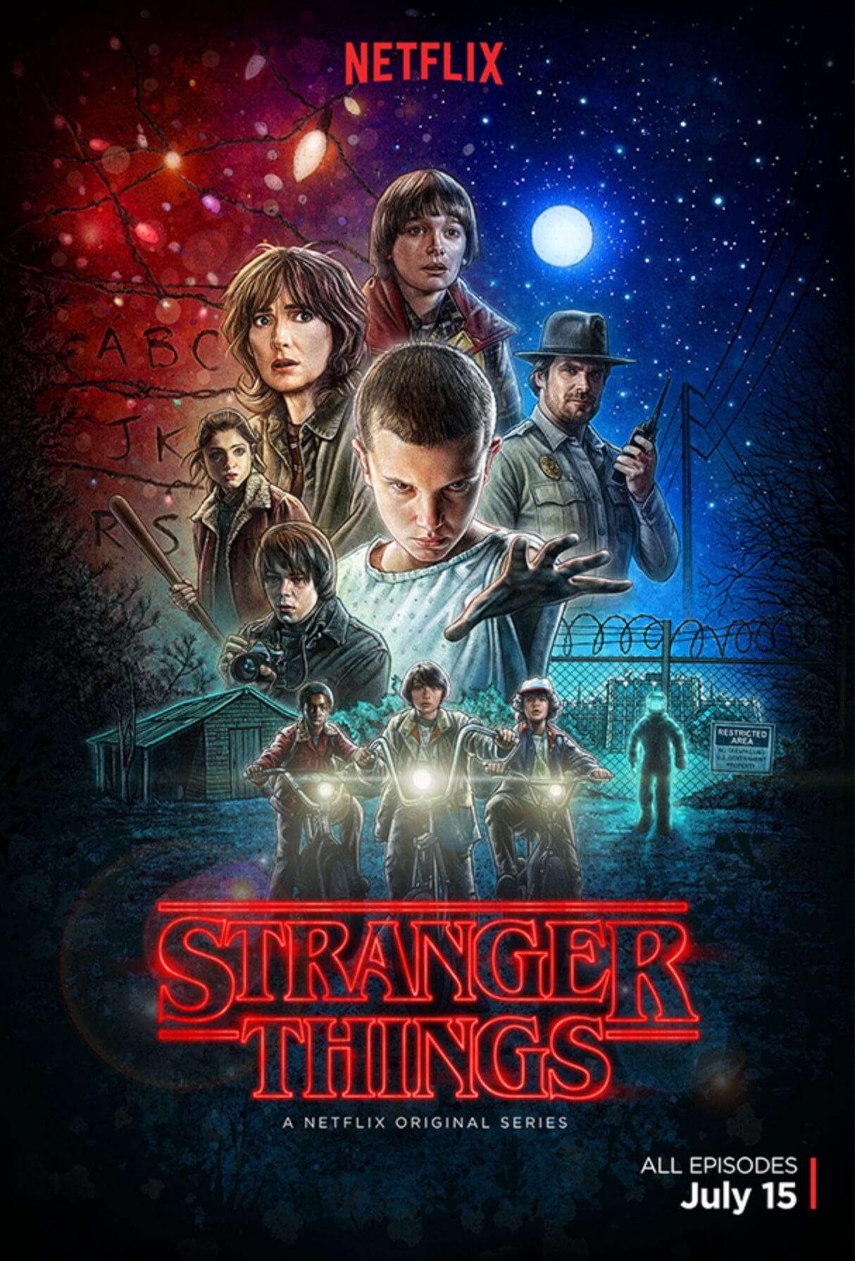
Almost every aspect of the show manages to incorporate the feel of the period. The title sequence, production design, wardrobe, music, and many other factors all contribute. Heck, even the promotional poster looks as though it’s from 1983. It’s really quite impressive.
After a little research I found out that the series was shot on the Red Epic Dragon with Leica Primes by Tim Ives. He did a fantastic job capturing the images necessary to create such a wonderful piece. Frankly I was a little surprised that they didn’t shoot on film to stay true to the image acquisition of the 80’s (although they did add a layer of scanned 35mm grain over the image).
The series was colored beautifully by Skip Kimball at Technicolor. From my observation, the way the color was approached had a lot to do with the production design and lighting that was used to mimic the 80’s. Some of the images captured in camera set the tone for the grade. Take a look at the example below…
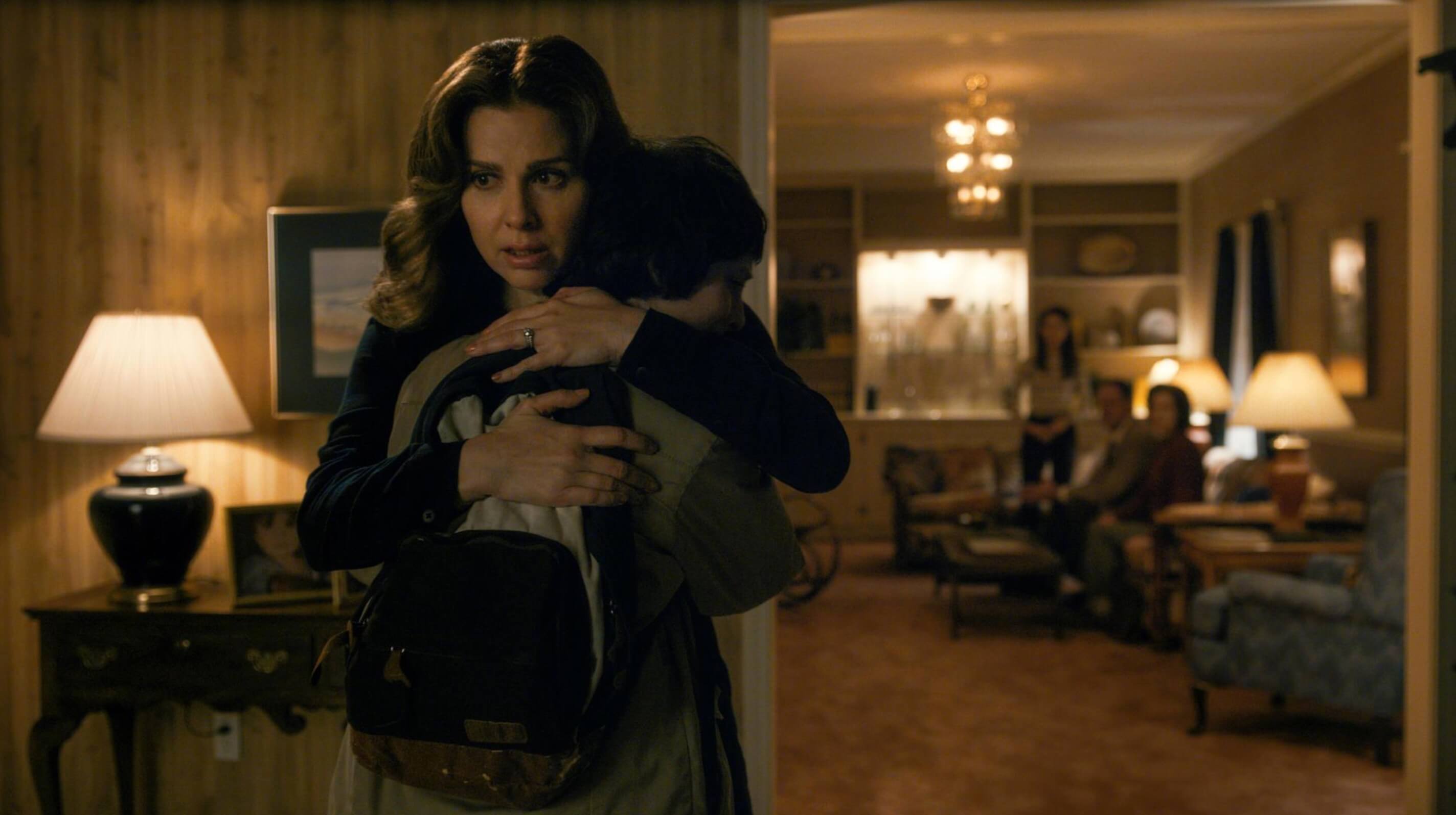
The scene is dominated by browns and oranges. All very warm. The wood paneling, the carpet, the lights – pretty much everything is in same color spectrum. I’m sure there is some windowing to help visually guide the audience, but there is really no place to introduce any other tone. A lot of this is lighting and production design. I imagine one of the most challenging things when working on a scene like this is making sure that skin tones stay true and are not too heavily influenced by the surroundings.
If you pay close attention, you’ll notice that all the scene’s in Mike’s (the main character) house are warm, even in the most dire circumstances. This is a conscious decision made by the filmmakers to give a sense of togetherness and family (an underlying theme throughout the series).
It’s the job of the colorist to make sure that these scenes stay true to the theme at hand which aids in a subconscious feeling of safety for the audience when at this particular location. Consistency isn’t the sexiest thing that happens in the color suite, but it’s probably the most important.
On the other hand, whenever we visit the government science enclosure everything takes on a cooler feel. This is an obvious contrast to the warm, happy suburban life that Mike leads. Eleven is alone and with nobody to care for her. I think there was most likely some heavy grading done in this environment to really bring forth that feeling of isolation.
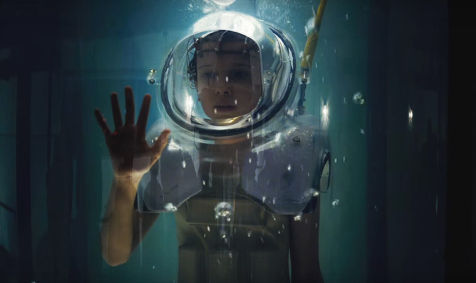
Along with the cooler feel in this location, there is a little bit of orange/teal going on to pop the skin tones. Which I feel is pretty standard in today’s grading style. It’s not extreme, but enough to be effective and achieve it’s intended purpose. This is a technique that wasn’t really possible in the 80’s, but I think this modern touch of DI workflow is very fitting for the circumstance and really makes for some powerful scenes.
Lastly, I wanted to include this still from a scene in the high school that feels like to could have been directly lifted from Sixteen Candles (and it doesn’t get anymore 80’s than that).
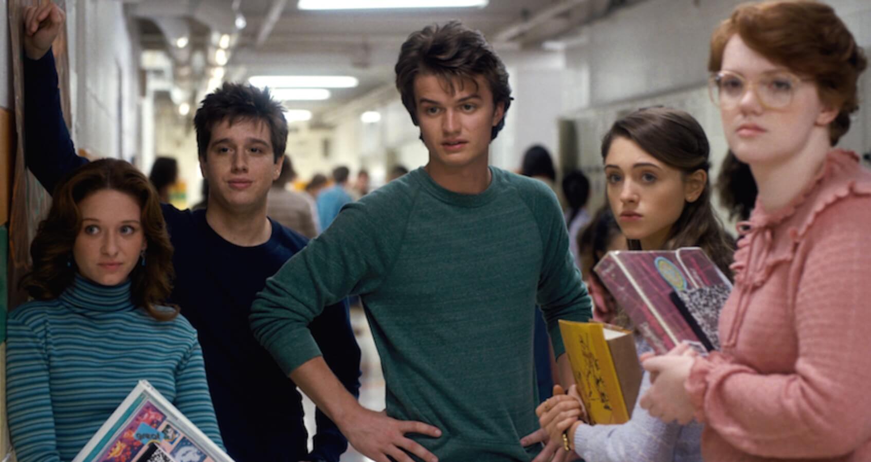
Softer pastels while still maintaining a solid black level really allow us to get a feel of what is going on in this location. Of course wardrobe, hair and makeup, and production design go a long ways as well.
I have a hard time not paying attention to the technical side of filmmaking and allowing myself to just sit back and enjoy the viewing experience. But in this series I was so caught up in it that it actually happened for me a couple times (which is rare for me). Stranger Things really feels as though it is all taking place in 1983, which is not an easy thing to achieve in this day and age. There are certain little modern nuances that help move the story along, but in a good way (the monster doesn’t look like anything from the 80’s). They help better tell the story without taking away from it. I was incredibly impressed with the series and am already looking forward to season 2.