It seems like film is making a bit of a comeback. It’s definitely not mainstream, but I feel like it’s more prevalent than it has been over the last couple of years. It’s nice to see some grain and texture introduced back into images, but it’s definitely not for everyone. There’s a certain aesthetic to it that people either love or hate. In the digital age, viewers have gotten so used to seeing super clean, crisp images, that when they see actual film grain, they think something is wrong with the image.
Instagram has been a great creative outlet for me. I’m getting to see a lot of interesting work that I normally wouldn’t be exposed to. Colorists, cinematographers, photographers, etc. There are so many talented, creative folks out there and it’s quite incredible to view their work in what is basically an online portfolio. I have gotten some inspiration and am quite fond of the photography of Todd Anderson and Cayetano González. I really like the way they use light, grain, and texture to shape their image. In my opinion, it’s something that isn’t done quite nearly enough in video. Photography offers a little bit more freedom and flexibility when it comes to this style of work. Viewing Todd and Cayetano’s work and others like it has pushed me to take things further and get a little more aggressive when the time presents itself.
As far as moving images are concerned, The Walking Dead is one of the most high profile shows shot on 16mm that is beautifully colored by Jeremy Sawyer at Light Iron in Los Angeles. The creative choice to shoot 16mm for this series is a fantastic choice, in my opinion. A gritty, dirty, hard edged zombie apocalypse should be as far away from clean and crisp as possible. The look of film totally aids in the dramatic story telling.
While watching this series the film grain behaves as I would expect it to. Clipped skies or skies bordering on clipping show grain the most. Peaking highlights in general tend to show more grain than the properly exposed portion of the image. That’s just the nature of the beast. Another place that seems to show off obvious grain are scenes that include a lot of foliage. Mainly in forests. The dappling of sunlight coming in through the trees combined with the green/yellow hue seems to show off more grain than I’d expect. I’m sure there’s some scientific reason for this, but I don’t know what it is. In general, grain is always present in The Walking Dead, and I really like it. It’s done in a manner that subconsciously puts the viewer on edge. It’s quite effective.
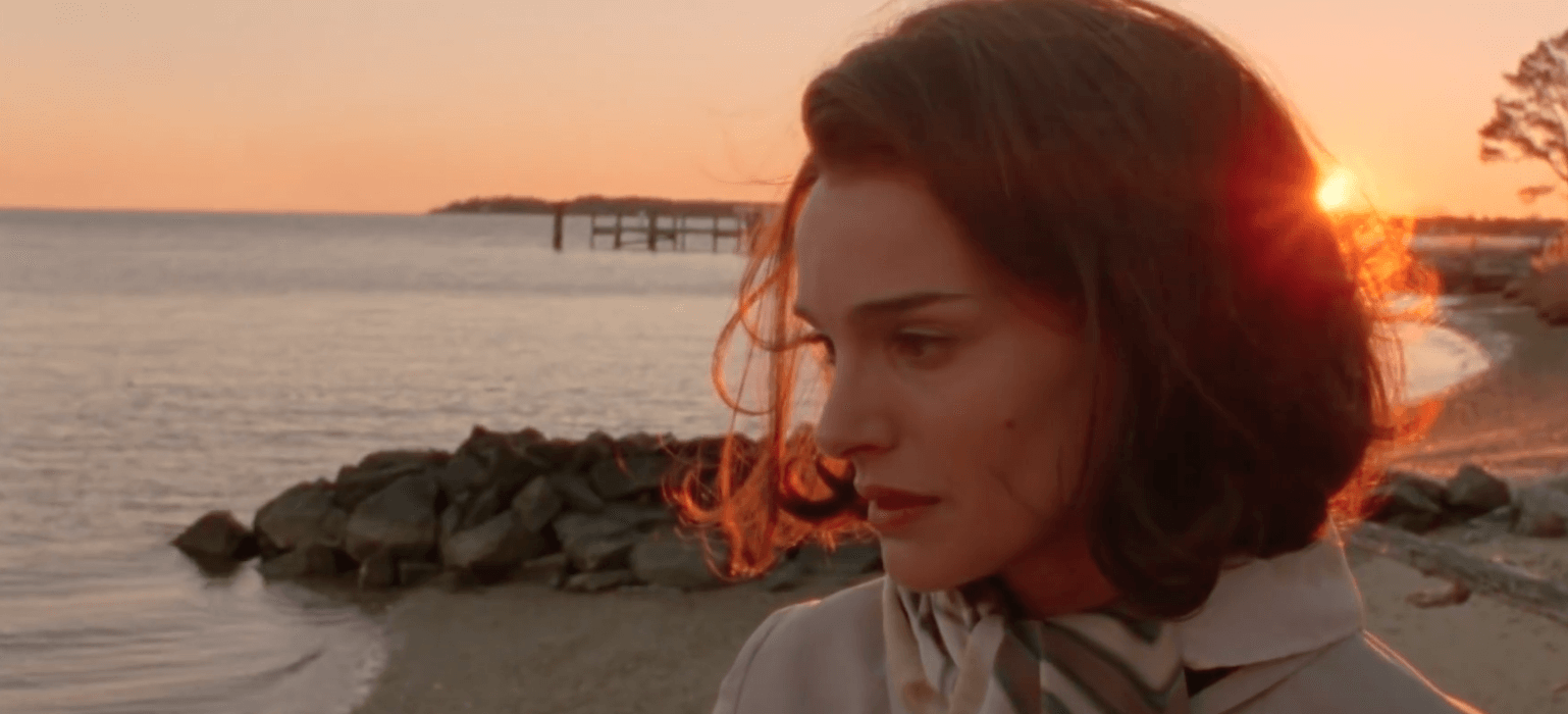
Switching from television to the cinema, there are two movies recently shot on 16mm that really stand out to me – “Jackie” and “Carol”. The grain texture on them is fantastic. If you get a chance to see them, pay attention to the fact that they’re shot on film and try to identify what makes them look that way. Look at how the black levels interact with the midtones, look at how the highlights roll off, look at the inherent softness in the grain. They’re all unique to 16mm. If you can mimic that in the color suite, you’re having a damn good day.
All of this brings me around to my point of this blog posting – Analyzing and mimicking grain. And it all really stems from how grain looks and works within an image. The only way to learn how it works is to see it, analyze it, and study it. Once you understand how it works, hopefully you can use it effectively to your advantage in the color suite. Major bonus points if you can shoot your own film. Then you REALLY get to experience it and have some fun.
Not many of us get our hands on 16mm these days. If film comes through the door, it’s almost always 35mm. 16mm generally ends up being more of a creative choice for the reasons that I mentioned earlier. I have heard from several colorists that grading 16mm “separates the men from the boys”. While I’m not sure if that’s necessarily true, I’d say that 16mm definitely has a different feel to it. It’s not LogC, that’s for sure. Shadows and highlights behave a bit differently and I feel like the look has to be nailed down during the production more than if you were shooting digital. I’m not sure if that’s true or not, it’s just a general perception that I’ve had.
There are all sorts of grain plug ins that do fairly good work in mimicking the look of 16mm. Gorilla Grain is one of my favorites. They offer some free packages, but all the real good stuff you have to purchase. It’s well worth the price of admission. I have had lots of success with their packages.
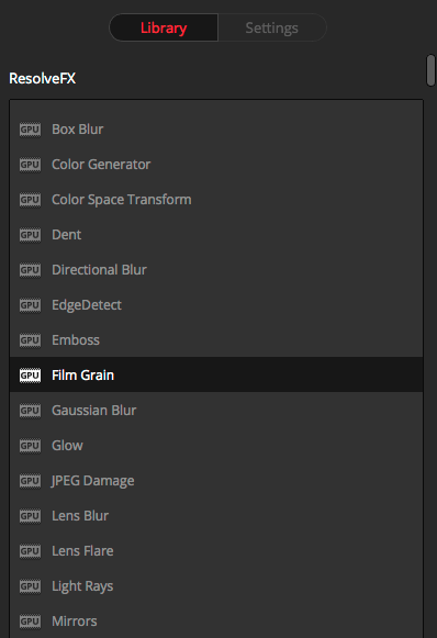
Resolve has an option for film grain in their OFX tab that offers a lot of flexibility in order to get the exact look you’re going for. Sometimes it’s really handy to add grain to a specific portion of an image that can be isolated through a window or HSL qualifier. It’s all right on the color tab, so it’s a quick and easy way to get the job done. Sapphire also has some real nice plug ins that I used to use more frequently before it was offered for free in Resolve.
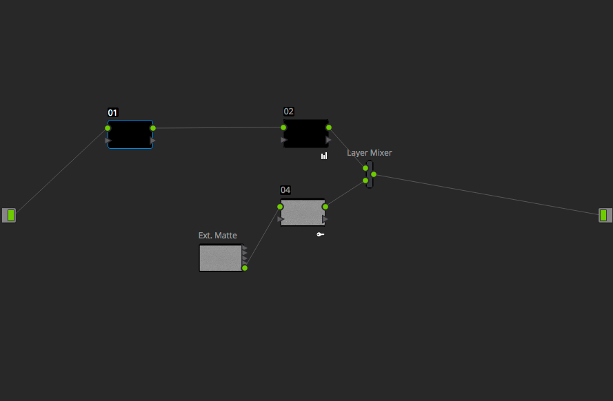
For me, the most effective grain that I have used is grain that I have created myself. We’re lucky enough to have an Arriscan film scanner where I work and I have used that to generate some really nice 35mm and 16mm grain. In our storage I have access to a lot of different film stocks. Some are pristine and others are downright filthy. It’s a bit of a crap shoot as to how it will come out, but at least I have control over it and can experiment while creating my own grain. In order to use it in Resolve you simply add it to your media pool as an external matte, generate an overlay layer mixer, add the matte, and point the output into the input of that node rather than the alpha input. Make sure to save a still before adding the grain and use the first layer mixer node to match back to the still to compensate for any color shift that the grain introduces.
All pretty straightforward stuff and nothing groundbreaking, but I really like the way properly utilized grain interacts with an image. A little bit goes a long ways. A nice subtle touch can totally take a piece to the next level. Wether you like it or not, it’s something to keep in your back pocket. You never know when the situation will present itself. By studying images that use grain effectively, you can use that to further your own work. Imitation is the best form of flattery, after all.