4k Delivery – Are we there yet?

I have been seeing a ton of RED footage in the suite lately.  4k, 6k, and 8K are all common occurrences.  It’s rare that I see anything acquired at 1080 or 2k anymore (which is pretty crazy considering where things were just a couple of years ago). I saw this article in Variety the other…

Learning on the Job

The job of a colorist is a combination of artistic and technical.  Knowing how to react to a specific situation while bringing forth the best image possible is probably the most important part of the job.  Doing it well and doing it consistently are pretty much what determines how successful you will be.  Experience plays a huge role as…

Del Toro in Colors

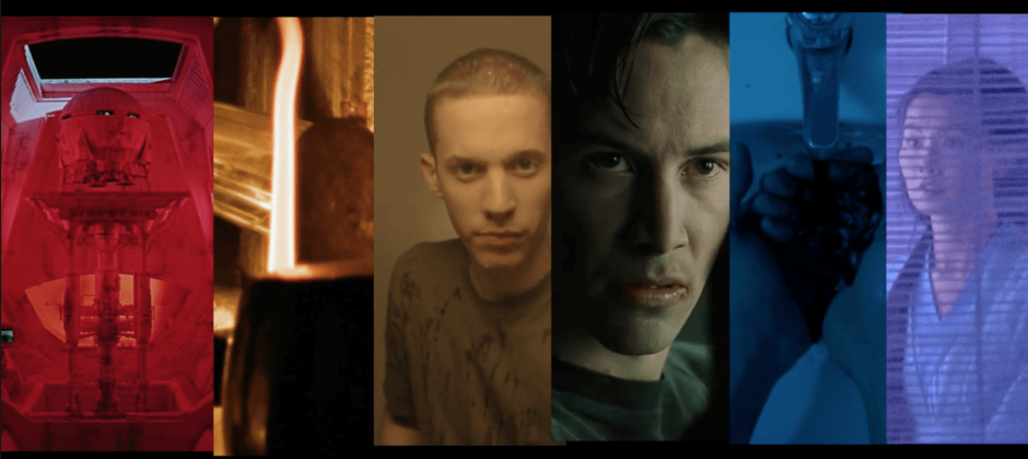
I am a big fan of Guillermo del Toro and his work.  One of my all time favorite movies is Pan’s Labyrinth.  I’m not sure why that movie resonated with me more than his others, but I just love the images that he captured in that film.  Frankly, as a whole, some of his work is…

Resolve 12.5 Top 5 Creative Features

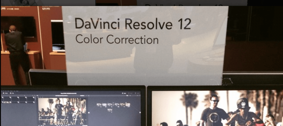
While working for Blackmagic Design as a demo artist during NAB 2016 I was able to get an insiders look at DaVinci Resolve 12.5.  I was on the beta team before the show, so I had been able to toy with the new features a little bit, but I didn’t get to dig too deeply…

The Importance of Reference

Earlier this month I was approached to work on a “fashion music video” that was used to release a new song while highlighting the Christy Dawn clothing line.  Definitely not something that you come across everyday.  I saw some of the raw footage and checked out the rough cut.  It had a lot of potential –…

Color and Box Office Results

One thing that I have learned over the years is that box office success (or lack thereof) is not a direct reflection upon the quality of the color grade.  Everyone loves to work on good movies.  It’s fun, exciting, and the buzz around them is almost tangible.  But what about the movies that you can…

Dos Equis passing the torch

Over the past 10 years one of the most identifiable campaigns has come from Dos Equis and “The most interesting man in the world”.  Havas Worldwide executed an extremely clever, unique, and sharp campaign that has been called one of the best of the 21st century.  Just this past week Havas announced that they are headed in a new direction and swapping out…

Cinematography Database

I have had a couple of interactions with cinematographer Matt Workman over the years.  He’s originally from Boston, so we have quite a few mutual contacts.  Every now and again, I’m lucky enough to get some of his work in the color suite and it’s always top notch. Recently, Matt has launched Cinematography Database.  It’s…

Advanced Technologies = Enhanced Experiences

As colorists, there is a fine line between the creative and technical aspects of our jobs.  We need to be able to address our work in a manner that allows for an innovative and unique approach.  But at the same time, we need to be aware of the new technology that is constantly changing and evolving. I…

The Story of Sarah & Juan

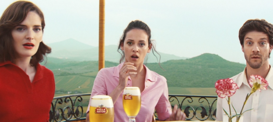
The funny thing about working in this industry is that even when we’re away from work, we’re never really away.  Television and movies are part of our everyday lives.  It’s really hard for me not to pay attention to the details.  Sometimes I try to turn off the “work” switch and just sit back and…

Technicolor’s workflow on The Revenant

Technicolor recently released an article that offers a behind the scenes look at their contribution to the award winning film, The Revenant.  I haven’t seen the movie yet, but from what I gather it looks like another hit from Alejandro González Iñárritu. The article hits upon Technicolor’s contributions to the film in extreme conditions while working with Alexa…

Pixar Color Palettes

I love these sites that display the color palettes of our favorite movies.  I have posted similar links in the past and they really showcase the subtle decisions that help set the tone and feel of a movie.  The people at Pixar are masters at evoking all sorts of emotions from their audience.  Their entire catalogue is…

Tone and Palette of “Carol”

I came across this article the other day and found it quite interesting.  I don’t know much about the movie, but this writeup definitely piqued my interest.  Colored by John Dowdell on Quantel Pablo Rio the look of the film is incredible.  This quote really grabbed me and I think it’s a perfect explanation of the feel that…

Go Creative Podcast

I was recently asked to partake in a podcast for the Go Creative Show with Ben Consoli to recap all things post production in 2015.  Along with cinematographer Chris Loughran and audio mix engineer Matt Russell we hit upon the trends of 2015 and had general discussions on our experiences throughout the calendar year. One…

Shadow and Midtone Relationships

Lately I’ve had to come up with a lot of creative looks in the color suite that depend on how the black levels are treated.  The lower end of an image can really help determine the overall look and feel of a piece with some detailed finessing.  But it’s not just about the shadows.  How…